Graphic facilitation, visual modeling and meaning

I often conceptualize visual thinking as being comprised of several distinct elements, at least from my perspective on the production side. I think of there being a dynamic component, in which we actively play with visual methods as we interact in order to make things clear which language might be obscuring. Napkin sketching, graphic recording and graphic facilitation fall in this category.

I also think of there being a static component, which is what I think of more as a visualization of some sort; some attempt to capture and synthesize a thought process, then produce a visual to represent the concept. This could be a model on a powerpoint slide, or a more elaborate and immersive visual representation, a mural, or interactive piece.

Last month I had the good fortune to work with a couple of incredibly talented scribes at the Middle East Summit of the World Economic Forum over in Jordan. What was very cool about the experience (okay, one of the many things that was cool about the experience) was that each of us was scribing in  a separate room over the course of a number of days, and what I saw emerge were not just different styles of scribing, but actually different approaches to modelling conversations.

It really got me thinking, and has started to bring me to a more nuanced set of thinking about the above visual thinking categories. Under the heading of graphic facilitation/recording, what I saw last month were four sub-categories, which I’d like to explore here:

  • Connective
  • Categoric
  • Synthetic
  • Illustrative

A little caveat; I’m not saying these are the only sub-categories, only that these were three distinct approaches the three of us seemed to be taking to represent the conversations in our respective sessions. Nor are the approaches exclusive, in fact, I would argue that in a given conversation, there would likely be great benefit in employing the three. What’s of major interest to me is what the approaches mean about how to listen, and what synthesis is done as a result of the listening process.

Connective Mapping
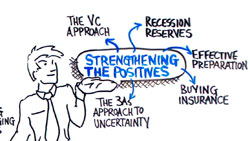
connective

Simple connective mapping (by me)

I’ll start with the connective approach, as this represents my initial understanding of what graphic facilitation was supposed to do. This approach is very much a derivative of mind mapping; showing the connections between interrelated ideas. I find I still use this as my default, especially when trying to capture things in a hurry, as it imposes a simple and flexible taxonomy on the concepts as they come.

The approach is largely hierarchical, capturing “topics” as a central node that radiates outward into connected sub-topics. The deeper into a sub-topic the conversation goes, the more connectors will radiate out from a given node. The advantage is that you don’t really need to know where the conversation is going to capture it, and it is easy to go back and file subsequent ideas where they belong, contextually.

There are, of course, a lot of ways of doing this, but in terms of the way of listening to and interpreting a conversation, this means paying attention to the structure of the conversation, identifying the unifying concepts and drawing connections between them.
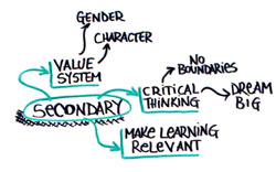
(Really) Simple connective mapping with sub nodes

(Really) Simple connective mapping with sub nodes (by me)

Categoric Mapping

This was something that popped out at me when looking at the scribing of Sita Magnuson during the Summit. I think, from a structural perspective, categoric mapping is virtually the same as connective mapping; it is the presentation that is completely different. The organization, again, is hierarchical, in that major topics form the basis for clusters, but instead of a radiant layout, text flows into ordered categories.
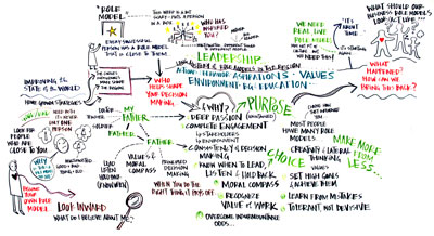
Using text layout to map categorically (Sita Magnuson)

Using text layout to map categorically (Sita Magnuson)

The challenge with this approach, and why I find it very appealing, is that it requires strong skills in text layout to differentiate topic areas. As you can see in Sita’s example, different size, font and color give a sense of differentiation and emphasis. In many cases here, the text itself is used as a connector between topics.

Also evident is the mixing of styles; there is some categoric mapping, some connective mapping as well as the next kind…

Synthetic Modeling

To really conceptualize this style, it helps to take a look at some of the models that I’ve put together below which attempt to capture some of the different levels within a conversation. There is a strong connection between this approach and the previous two, in that it relates to the conversation on a structural level, but takes the approach of addressing the structure itself, showing the relationships of the various elements with each other on a conceptual level. This example is from Kelvy Bird’s scribing at the Summit.

This style was really interesting to me. It begins to make the structure of the concepts and the conversation visible, while at the same time divorcing itself from the temporal element of the interaction.
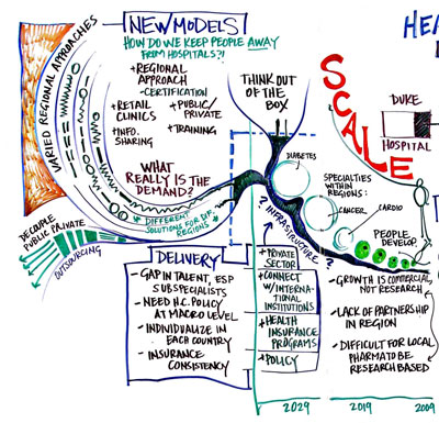
A synthetic approach to modeling a conversation (Kelvy Bird)

A synthetic approach to modeling a conversation (Kelvy Bird)

Illustrative Modeling

The illustrative style is the one that, predictably, gives graphic facilitation its name. This is, of course, a style that is interspersed within each of the other methods to approaching the conversation. Illustration can be a part of the structure, it can be an independent element, or it can be the structure itself. The idea of illustration, however, is to directly engage meaning. In the connective approach, for example, meaning is derived; here, the meaning is conveyed in a direct manner. This goes back to my earlier point that visuals can be employed where words are obscuring meaning.
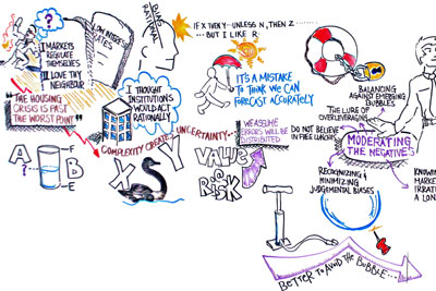
Illustrative modeling (by me)

Illustrative modeling (by me)

In the example here, I’ve thrown in images that directly (I hope) trigger understanding and, by extension, better recall than could have been done with text.

This, for me, is much easier when people are having a conceptual discussion, rather than a tactical, detail oriented one. I’ve included illustrative modeling because of how it relates to some of the conclusions that have come out of this comparison for me.

A Model of Conversation

After sitting down with this and mulling it over, I found the only way I could start to make sense of it was to come up with some kind of model for conversations, listening and recording. Kelvy got me started thinking about different ways of listening, and this is my first cut at answering that. There seemed to be four elements to an interaction: flow/time, structure, meaning and concept.

Flow is quite simply a byproduct of the fact that conversations take place in time, and are thus necessarily carried out within some sequential confines. This is important, since time dictates how we are presented with information.
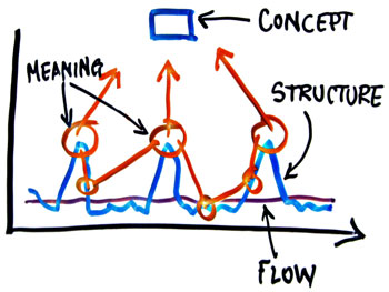
The four layers in conversation.

The four layers in conversation.

Structure varies based on a lot of things, not least of them the number of participants in a conversation, but also the style of presenting an idea, the contentiousness of the topics, as well as the relative emphasis or interrelatedness of various elements. Topic, sub-topic, sub-topic, new topic, important point, side note…this is the general structure of the conversation. It’s worth noting that this is separate from flow; the relationships which make up the structure do not necessarily line up in time (in fact, they rarely do…people ramble, digress, come back to points they have more to say on…).

Through all of this we assemble meaning. We pull out snippets here and there, and from this we put together our understanding of what is being said. Again, this is an independent element, which is – in part – why we can all leave the same conversation with a different understanding of what’s been said.

The concept layer, I think, is independent of meaning, though it is deeply connected. People can exchange meaning without generating a concept, but a series of related elements of meaning can begin to create something which is emergent.

I’ve sketched this out in two different models here for the purpose of getting an idea of how the various approaches map.
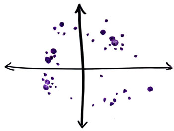
Elements of meaning plotted out in a scatter, without a time dimension.

Elements of meaning plotted out in a scatter, without a time dimension.

First is the conversation itself, which I’ve drawn here as a scattershot of ideas, some bigger than others, some that are outliers and others that are clustered together. I’ve deliberately drawn this one differently from the model above to try and escape from the time dimension and focus solely on the content of the conversation. Admittedly, the two axes are meaningless. Ah well.

Your standard linear notetaking approach would look something like the line in blue, which is forced to follow the meandering path of the conversation whereever it may go in time.

The clustering or categoric approaches to listening, while still connected with the time dimension, pays most attention to correlation and clustering within the various clouds of meaning, paying attention to emphasis and affinity.
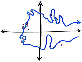
Linear notetaking following the temporal flow of the conversation. It actually probably isn't even this connected looking, now that I look at it.

Linear notetaking following the temporal flow of the conversation. It actually probably isn't even this connected looking, now that I look at it.

The synthetic approach, I think, goes back to the original model of the layers of conversation; the ‘concept’ is separate from the structure. This separate layer, from a visual perspective, can be plotted out and used as the structure within which clustered elements can be organized.

The entire concept, for me, is very reminiscent of the old Taoist ways of representing communication and knowledge. There’s a saying about words being like the finger pointing to the moon; stare at the finger, and you’ll miss all the heavenly glory.

I would be interested to get some ideas and feedback on this (not least from Sita and Kelvy!)…how do others conceptualize ways of conversation, listening and of how to model what we hear?
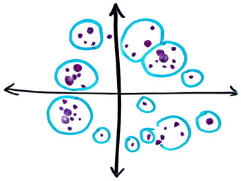
Capturing correlated pockets of meaning through the clustering approach.

Capturing correlated pockets of meaning through the clustering approach.
Leave a Comment

Structuring conversations for visualization

There’s a constant challenge with creating complex visualizations; how to manage the process of gathering input from the group? Solitary acts of artistic brilliance create beautiful pieces of work, but they may not actually connect with the intent of the group, and it’s pretty much impossible to capture a meaningful level of detail on the complexities of the process, system or concept being modeled.

On the other hand, involvement from the group – if it isn’t structured enough – can lead to pretty confused images, or can force you to resort to “recording” rather than synthesizing.

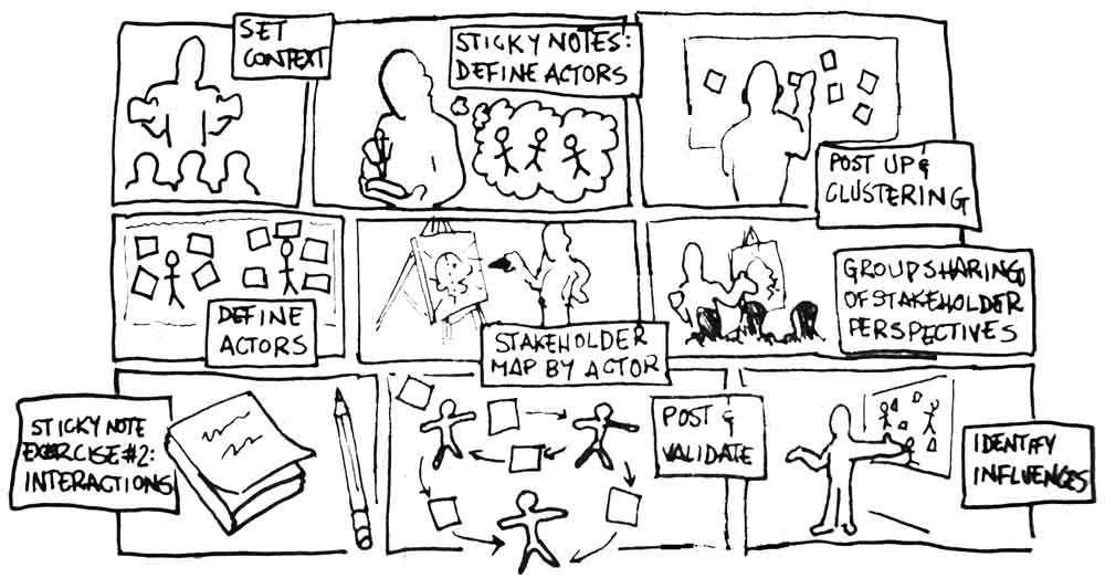
I did a quick sketch of what I like as a process for engaging a couple of groups to create a stakeholder map; a complex interaction diagram that would model the actors, interactions and influences within a given system.

Stakeholder mapping

I like this approach because it gives the chance to really get some in depth perspectives before too much structure gets imposed on it, but gives lots of opportunity to introduce some visual frameworks and metaphors through the exercise to keep it creative. The result is a cohesive body of information with a lot of nested complexity; perfect fodder for using as an input for the development of the final visualization.

Leave a Comment

So Much for The Wisdom of Crowds

Image courtesy of NYTimes.com

Image courtesy of NYTimes.com

It is somewhat vexing to see the hounds jumping on Alan Greenspan in the rush to assign blame for the financial crisis to a single individual. That’s the way of politics, I suppose, that many feel the need to find someone to single out, someone towards whom we can all point an accusing finger so we can, ourselves, feel absolved.

But for those with an interest in collaboration and how groups of individuals make decisions and work together, this whole mess brings up a question of a favourite text on collective decsion making; Surwiecki’s The Wisdom of Crowds.

What made me think of this was a quote from Greenspan in his Congressional hearing; “Those of us who have looked to the self-interest of lending institutions to protect shareholders’ equity, myself included, are in a state of shocked disbelief.”

What he’s talking about is a fundamental belief that through aggregated or collectivized self-interest and rational decision making on a distributed basis, better decision will be made…also known as the wisdom of crowds, group genius, or whatever you want to call it.

This, for me, points to a caveat for those who believe in collaboration and collective action as the best way to get things done:

  1. actors will likely only act rationally when rational micro-action can be expected to happen within a context of rational macro-outcomes
  2. collective action is effective only when the environment supports self interest that is rational

There’s a lot of overlap between those two things, but some of the distinctions, I think, are important. Ultimately, point #1 should create the “environment” for point #2. The issue is that within an irrational environment, there is little incentive to behave rationally, and in the case of the stock market and the mortgage bubble, there was significant (short term, as it turns out) incentive to behave in an irrational way.

If I think of the implications of this model for large organizations, it would seem that major organizational change can only really happen effectively if people can be assured that making good decisions within their part of the world will be met with collectively desirable outcomes at a macro level.

The lesson for all of us, and Mr. Greenspan, is that – as he suggests – we must continue to rely on the rational self interest of individuals and institutions, but it is the responsibility of leaders (and government) to set a rational context for those decisions.

Leave a Comment

Prototypes, Visuals, and Taking Concepts to Reality

I know I shouldn’t be as excited as I am, but I can’t help it. Making something that was ethereal, theoretical into something physical and tangible is, well, exciting. Last week, I got my book in the mail. Not just any book, but my book. The moment I clicked “buy” on lulu.com, the hundreds of pages of text that once languished on a hard drive in my basement went from being a project-on-hold to being something real.

Back up a second for those who don’t know; a few years ago – before child number one was born – I put my career on hold for a year to work full time on a novel that had been a part time passion for a while before that. In that year, I sweat blood (not literally…that would have ruined a lot of shirts) and slaved away hammering out a sprawling manuscript that I hoped would capture a lot of the ideas I was struggling with at the time. When the year was done, I had a tome which no other eyes had seen, and a year of lost income and a baby on the way…tough math for a dad-to-be.

Frustrated with the product, an editing process that was more than I bargained for and the sudden need for income, I shelved the project, convinced of the need for a rewrite.

And it sat. For two years. No one talked to me much about it. Everyone knew the work that had gone into writing that book…but what came of it?

Here’s where it gets interesting. At a workshop with Dave Gray, I heard about Lulu.com, and within days, posted my manuscript and ordered a copy of my own book. Just that process got me excited.

But then it arrived, and suddenly people around me wanted to read it. It had become something accessible, physical…real. I even got excited about it…MY BOOK! I felt pride, and a feeling that it had finally been externalized; no longer rattling in my head. And that’s when I realized that what I’d really done was to create a prototype of my book. And just like that, you have something to show people. Family started to get excited…and more than anything else, it’s now getting read.

This has been a fascinating parallel to the other area I’m working in; the visualization of processes and problems that clients are struggling with. The whole visualization process is – I think – like a prototype; giving people something tangible they can relate to and understand, rather than something abstract which they can’t kick the tires on and imagine.

So much work is put into things which can’t be seen by others, and consequently it can often languish in a netherworld of indifference and incomprehension. Nobody wants to see your shoebox full of half-baked ideas, but hand them something recognizable and the game changes completely. It can be as simple as binding your book or drawing a picture of what you’re talking about, but one thing I know for sure:

Prototypes matter.

Leave a Comment

VizThink and Dave Gray

I attended a VizThink workshop with Dave Gray a few weeks ago here in Toronto; lots to say about it, but for now I thought I’d post my notes…

Leave a Comment

Dificilitation…a challenge to our Pattern Language?

We explain our approach to facilitation as coming from the roots of the word: to make easy. This really runs back to the roots of the method, which is grounded in part by the writings of Christopher Alexander and his concept of patterns in architecture which either encourage or inhibit a natural flow.

It’s a wonderful concept; create a flexible work environment and patterned working process which removes all barriers and inhibitors which stand in the way of highly productive work. The concept has equal force whether it is applied to work or environment, or in the case of how we use it, when both are combined.

That is why I read this article in the New York Times (with an excellent audio slide show) with such interest. Artists and designers Arakawa and Gins have created spaces that run counter to the paradigm of designing for comfort…they have designed a house that challenges. The floors undulate and are bumpy (yes, bumpy!), the plugs and switches are helter skelter and there is barely an even surface in the place.

The idea? In their sworn effort to defy death, they have made it their mission to design spaces which force work and adaptation, creating stronger, healthier individuals.

This got me thinking. When is it better to “make easy”, and when is it better to make things difficult? There are definitely parts of our process which, I know, push people outside of their comfort zone, and it’s the hard work and cognitive dissonance of being out of the status quo that often encourages superior results.

In one of our internal sessions a few years ago, we removed all the furniture and fittings from the center in order to force the group to consider what was truly necessary in a space. It was uncomfortable, but some great dialogue came out of it.

I’m curious; who designs their sessions with comfort and discomfort in mind? When, in your mind, does facilitation mean making things harder for people?

Leave a Comment

Setting Up Google Sites

This is the second part of my report on using Google Sites in a session last week; the first part was the “what”, the next part is the “why”, but for now, I’m going to confine myself to the almighty “how”.

The first thing to understand is that all of the flavors of Google Apps require a domain name, which you can purchase as part of the sign up process. This is not to be confused with “Google Docs”, which you may have encountered as an add-on to your GMail account. What they’ve done is take a number of their services and mash them together, so you get a single stop for mail, documents and now, sites.

(more…)

Leave a Comment

Pressure-Testing Google Sites

This week we wrapped up a session in Detroit working with New Paradigm, IBM and an automotive client to help put together Enterprise 2.0 enabled solutions for their enterprise and partners. Leading up to the session, there was a good deal of thought back and forth as to which tools we should use to put together the session deliverables.

About two weeks ago, Google announced the very timely release of Google Sites, the long-awaited retooling of JotSpot as a part of their Google Apps suite. The timing seemed perfect, and I could think of no better time to give the tool a test drive. The results? Well after two days of building the session journal real-time with 30 participants logging in as we built, all during a North America-wide disruption in the Capgemini network, I can say that there were some stressful times, but the results have been positive. I say that, however, with a considerable number of caveats. I thought it would be useful to capture some of the frustrations, highlights and tips here…

(more…)

Leave a Comment

Collaboration, curry, and the importance of the creation process

Maybe it’s just me, but I derive a lot of inspiration from food, and do some of my bthai curryest thinking in the kitchen. And so it was, on the weekend, when I found myself trying out a new mortar and pestle (much different from the other two I own!) that I started thinking through what it means to create something.

I generally take the shortcut when I make my curry paste. I take all the lemon grass, the chillies, the garlic, and throw it in the food processor. But to test drive the mortar and pestle, I decided to do it the hard way; chopping and pounding each and every ingredient until I had a uniform paste. From the moment I started, the lemon grass began releasing an incredible aroma, and as I incorporated the chillies, I could see their color spread into the paste as it was pounded into the basalt. At every stage, I could see the transformation unfold, the smells and sights flooding my senses.

The result? A profound sense of connection and excitement about what I had produced; anticipation of what it would be like to use it. I understood something more about the paste and the process, and thought more deeply about the end product, when at last, I sat down to eat. What would I change next time? What worked? What didn’t? And most of all; pride. The final dish was the result of my work and effort, and it tasted all the better for it.

I was halfway through pounding out the ingredients when I started to think about the parallels with what we do; our workshops are the grueling hard work of leaders sweating it out with their people to pound out a solution that everyone has had a hand in. Each decision, each input, is seen, sensed and understood by the people who take part, and the end product is something that people can’t help but feel a deep connection and commitment to.

Solutions handed down from the top are the fast food of decision making: they are mysterious, uniform, uninspiring and generally unappetizing. Who knows what’s in there?

Co-creation is, to be sure, a lot more work. But when it has to count, there’s no better way to ensure results. You can’t put a price tag on how invested people become, just like there’s nothing you’ll find in the supermarket that compares with what I pounded out for an hour on Sunday afternoon.

Leave a Comment

Environment and the King of No-Form

In whatever spare moments I can muster, I’ve been reading Christopher Alexander’s brilliant book, The Timeless Way of Building. I find it overwhelming. Brilliant. Most of all, it has raised my appreciation of environments and how they affect interactions.

Needless to say, then, I have had Alexander’s words ringing in the back of my head lately, and I have been considering things through the lens of his ‘patterns’. That relational elements of any environment form patterns which, taken together, can be taken as a language; that this language forms the basis of our interaction with the space around us, both in how we exist within it and work to create, modify and relate to that environment…I find this profound.

I understand now, more than ever, that the spaces created to support our methodology are not intended as cookie-cutter franchise facilities. They are meant to express the patterns which are core to the language of cooperation and collaboration. To enter a place where the physical space strongly expresses a way is a powerful idea.

But this week I had a conversation regarding a client which got the gears turning for me, especially as it is such a recurring theme; how necessary is the environment? How much can you compromise?

(more…)

Leave a Comment
UA-3519374-1 eXTReMe Tracker